어제 여기까지 했었다.

추가하기 기능을 먼저 만들건데, 그럴려면 제목과 내용 input 이 각각 하나, 저장하기 버튼 , 닫기 버튼이 들어간 컴포넌트를 만들고 추가하기 버튼을 크게 하나 만들어 눌러야 추가할 내용 넣는 컴포넌트가 뜨도록 할거시다.
근데 좀 신경쓰이니까 버튼 컴포넌트랑 input 컴포넌트 좀 만들어둘거임.
//ButtonElement.vue
<template>
  <button @click="clickEvent"><slot /></button>
</template>
<script>
export default {
  name: "ButtonElement",
  props: {
    clickEvent: Function,
  },
};
</script>
//TodoCard.vue
<template>
<section class="todo-card">
<h3>{{ item.title }}</h3>
<p>{{ item.comment }}</p>
<button-element>edit</button-element>
<button-element>remove</button-element>
</section>
</template>
<script>
import ButtonElement from "./ButtonElement.vue";
export default {
components: { ButtonElement },
name: "TodoCard",
props: {
item: Object,
},
};
</script>대충 버튼 컴포넌트 만들어두고 카드 컴포넌트의 버튼을 갈아끼워주자. 스타일은 나중에 할거임. 기능먼저하는게 맴이 편혀.
자식컴포넌트의 <slot/>에는 부모컴포넌트에서 불러온 자식컴포넌트의 태그 사이에 들어가는 내용물이 들어간다.
여러개의 <slot/> 을 쓸 수도 있는데 귀찮음 그거 name 정해줘야함
// InputElement.vue
<template>
  <label>
    <h3>{{ title }}</h3>
    <input />
  </label>
</template>
<script>
export default {
  name: "InputElement",
  props: {
    title: String,
  },
};
</script>
input 컴포넌트도 적당히 만들어주고..
//AddCard.js
<template>
  <section>
    <button-element>close</button-element>
    <input-element title="title"></input-element>
    <input-element title="comment"></input-element>
  </section>
</template>
<script>
import ButtonElement from "./ButtonElement.vue";
import InputElement from "./InputElement.vue";
export default {
  components: { InputElement, ButtonElement },
  name: "AddCard",
};
</script>
카드를 추가하는 컴포넌트도 적당히 이렇게 만들었다.
//App.vue
<template>
  <img alt="Vue logo" src="./assets/logo.png" />
  <todo-main></todo-main>
  <button-element>Add card</button-element>
  <add-card></add-card>
</template>

<script>
import AddCard from "./components/AddCard.vue";
import ButtonElement from "./components/ButtonElement.vue";
import TodoMain from "./components/TodoMain.vue";
export default {
  name: "App",
  components: { TodoMain, AddCard, ButtonElement },
};
</script>
그리고 App.vue 에 만든 컴포넌트들을 추가해주자.

뺨.
근데 좀..보기 힘들다. 초반에 CSS 넣는거 별로 안좋아하는데 넣어야겠다.
//App.vue

<style lang="scss">
#app {
  font-family: Avenir, Helvetica, Arial, sans-serif;
  -webkit-font-smoothing: antialiased;
  -moz-osx-font-smoothing: grayscale;
  text-align: center;
  color: #2c3e50;
  margin-top: 60px;
  * {
    margin: 0;
    padding: 0;
    box-sizing: border-box;
  }
  section {
    box-shadow: 0 0 10px rgba(0, 0, 0, 0.257);
    max-width: 480px;
    margin: 20px auto;
    padding: 20px;
  }
}
</style>
스타일 코드를 추가해주었다. scss로..
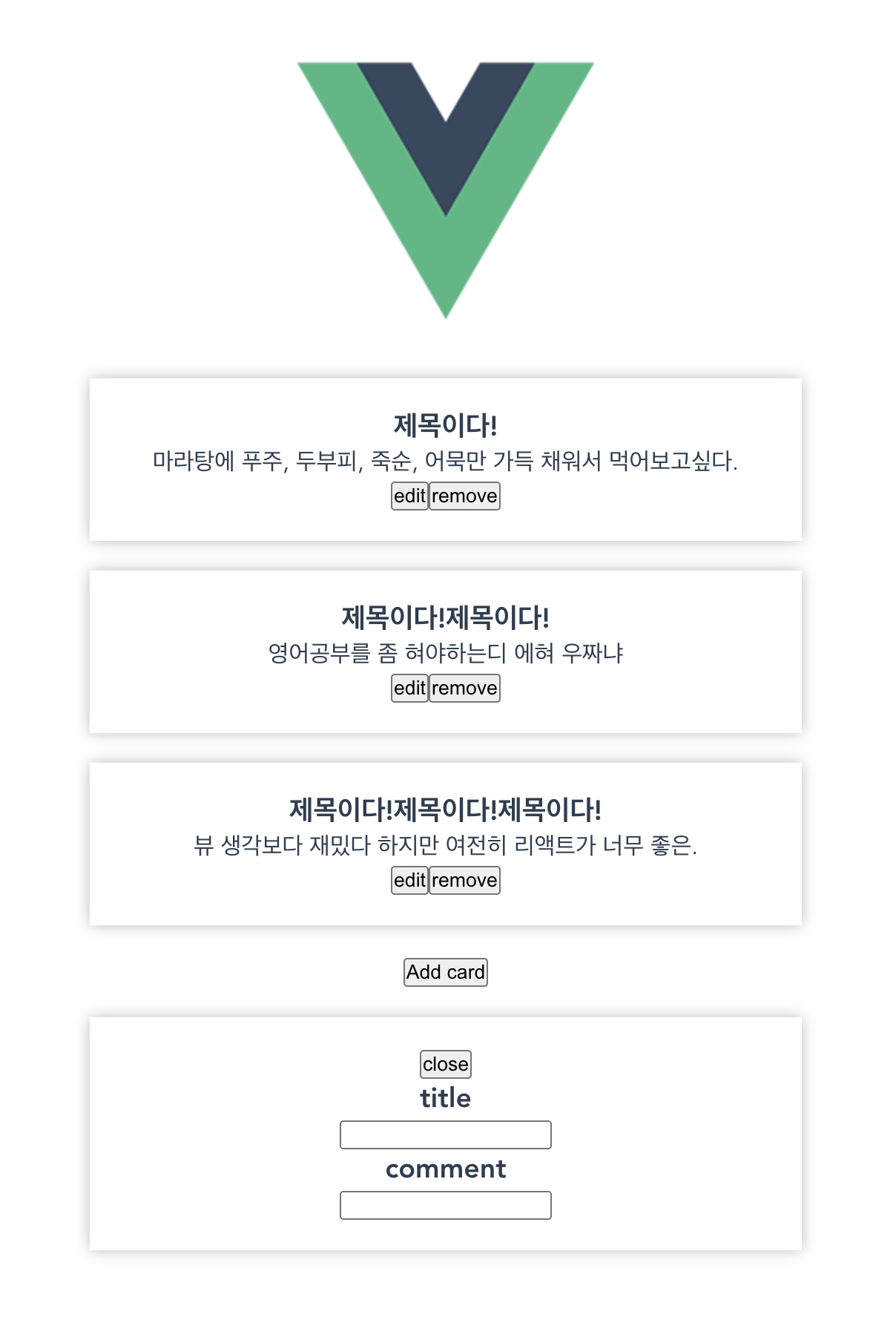
뺘뱜. 좀 낫다.
헐 세이브 버튼 까먹음
//AddCard.vue
<template>
  <section>
    <button-element>close</button-element>
    <input-element title="title"></input-element>
    <input-element title="comment"></input-element>
    <button-element>save</button-element>
  </section>
</template>
잘 뜸.
이번엔 버튼을 눌렀을때 AddCard 컴포넌트가 보이지 않다가 보이게 할것임...
//App.vue

<template>
  <img alt="Vue logo" src="./assets/logo.png" />
  <todo-main></todo-main>
  <button-element @click="showCard">Add card</button-element>
  <add-card v-if="addCard"></add-card>
</template>

<script>
import AddCard from "./components/AddCard.vue";
import ButtonElement from "./components/ButtonElement.vue";
import TodoMain from "./components/TodoMain.vue";
export default {
  name: "App",
  components: { TodoMain, AddCard, ButtonElement },
  data() {
    return { addCard: false };
  },
  methods: {
    showCard() {
      this.addCard = true;
    },
  },
};
</script>
Add card 버튼을 클릭하면 showCard 함수가 실행된다. showCard 함수에서는 data에 불리언 값으로 저장된 addCard 를 true로 바꿔준다.
그럼 <add-card>에서는 v-if 를 통해 addCard 값이 true 일 때만 컴포넌트를 노출시키기 때문에 Add card 버튼을 누르면 컴포넌트가 뿅 나타난다. 근데..지금 깨닳았는데 이거 add-card 컴포넌트 안의 close 버튼을 눌렀을 때 꺼지게 해야한다.
...여기까지 어제 적었다. 그리고 오늘 composition api의 사용법을 어느정도 알게되어서 따로 글 분리하려고 그럼 20000.
'프로젝트' 카테고리의 다른 글
| Vue 3 + Vuex 로 Todo-List 만들어보기 (4) + Composition API로 바꾸기 (0) | 2022.05.03 |
|---|---|
| Vue 3 + Vuex 로 Todo-List 만들어보기 (2) (0) | 2022.04.27 |
| Vue 3 + Vuex 로 Todo-List 만들어보기 (1) (0) | 2022.04.25 |